css에서 배경이미지를 화면에 맞게 정렬하는 방법.
조회수 11417회
pc와 mobile에서 봐야하는 웹페이지를 제작중입니다.
배경이미지를 넣을려고하고요. css에서 다음과 같이 코드를 작성했을 때, 첨부된 이미지와 이미지가 화면에 알아서 맞춰지지 않고, 반복적으로 나옵니다. 저는 화면 크기에 알아서 잘 맞아떨어지도록 배경이미지를 배치하고 싶습니다.
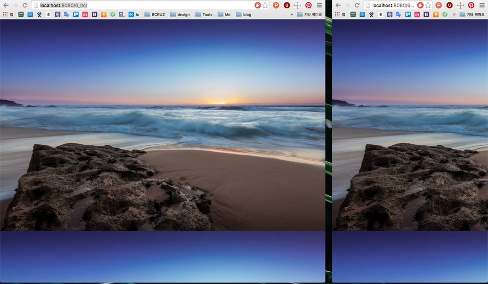
작성중인 css 코드는 다음과 같습니다.
body{
    background: url(https://static.pexels.com/photos/24428/pexels-photo.jpg) ;
}

1 답변
-
css에 다음과 같이 입력합니다.
body{ background: url(https://static.pexels.com/photos/24428/pexels-photo.jpg) no-repeat center center fixed; -webkit-background-size: cover; -moz-background-size: cover; -o-background-size: cover; background-size: cover; }-
(•́ ✖ •̀)
알 수 없는 사용자
-
댓글 입력